
The cutout is only the beginning
A clean edge is only one part of a good cutout. Review subject choice, motion, lighting, scale and the exported composition before publishing.
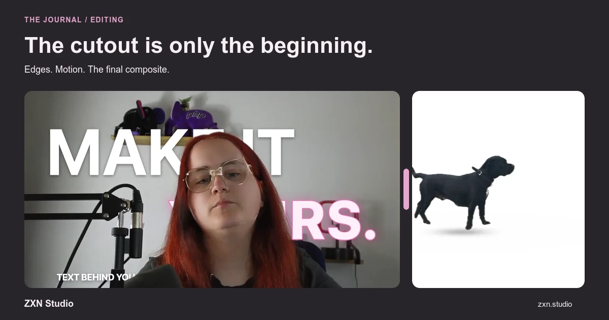
Removing a background solves a separation problem. It does not automatically solve composition, lighting or storytelling. A subject can have a neat outline and still look misplaced, obscure the demonstration or distract from the message. Judge the cutout inside the finished scene, not only against the editor's preview background.
Use this checklist after your first removal pass. Its purpose is to decide what needs correction, what needs redesign and when keeping the original background would be the better choice.
First, decide what the cutout contributes
Write down why you are removing the background. Perhaps a presenter needs to sit beside a screen demonstration, or a product needs to remain visible over explanatory footage. That purpose tells you which details matter.
If the only reason is that the feature exists, try the composition without it. A simple camera frame can preserve context and avoid drawing attention to difficult edges.
In ZXN Studio, Free includes people background removal using RVM. Studio adds all cutout models and live background removal. Choose a subject-appropriate model rather than expecting the people option to solve every kind of footage. The background-removal guide covers the initial setup.
Check what remains, not just what disappears
Inspect the subject's identity and important details. Are the hands needed for the explanation still present? Is a product's outline intact? Has the treatment retained an unwanted piece of the original surroundings?
Look at both a still moment and a demanding movement. A good-looking face does not compensate for fingers vanishing whenever the presenter gestures.
Use correction controls to address a visible error, then review the same sequence again. Avoid repeatedly tightening the whole outline to remove one background fragment; that can trade a small remnant for missing subject detail elsewhere. A different model or take may be the more sensible correction.
Review against the background you will use
A subject that looks convincing over one background may look awkward over another. Inspect the composite against the actual footage, including its brightest, darkest and busiest moments.
Look for outlines that attract attention, fragments that resemble holes and areas where subject and background become difficult to distinguish. Do not judge the entire shot from whichever preview frame happens to look best.
If the background changes throughout the video, review those changes as part of the cutout test. A stable edge is only useful when the subject remains understandable in the scene where it will appear.
Make movement your acceptance test
Play the clip at ordinary speed and watch the outline rather than the centre of the subject. Note repeated flicker, disappearing details and fragments that return during turns or gestures.
Then watch again while following the intended explanation. This second pass helps distinguish a minor technical imperfection from a distraction that genuinely competes with the message.
A practical test sequence includes entering the frame, turning, moving hands and leaving. Choose moments that exist in your actual footage, not a specially selected still section. If the treatment cannot hold up during the movements the video needs, reconsider the shot instead of disguising the issue with more animation.
Match scale, position and colour
Place the subject where the scene gives it a clear role. A presenter explaining an interface should not cover the active button, result or title. Leave room for gestures and avoid cropping important movement accidentally.
Compare the subject's apparent brightness and colour with its surroundings. Use colour corrections to reduce distracting mismatches, but do not expect colour work to restore missing hair or hands.
Also consider whether the subject appears to be intentionally overlaid or supposedly part of a realistic scene. A clean graphic overlay does not need to imitate a room. An attempted realistic composite creates additional expectations about perspective and lighting that may not serve a simple tutorial.
Add depth only when the flat layout works
ZXN Studio's paid plan includes depth occlusion, 3D surfaces and motion tracking. These can support a deliberate composition, but their availability does not mean every cutout needs them.
First make the subject readable in a straightforward arrangement. Then ask whether another spatial relationship helps explain the content. If an element passes in front of the subject, check that it does not hide information at the moment it matters.
Review the whole movement after adding any treatment. A still image cannot establish whether a layered composition remains clear over time.
Export the difficult section before the full video
Create a representative test project and export using the intended delivery settings. Inspect the finished file outside the editor for edge behaviour, text overlap and movement. Local preview behaviour and exported results are separate checks.
Studio-only models and treatments may be previewed in Free, but export identifies clips requiring Studio. Also, a transparent-looking preview does not by itself establish a supported transparent-video delivery workflow. Consult export guidance.
The cutout is finished when it supports the message without demanding attention for the wrong reasons. Sometimes that means one more correction; sometimes it means a calmer background, smaller presenter or different take.